One of the main strengths of the Trellis graphics paradigm is the use of panelling to divide data into subsets to investigate whether patterns are consistent as the conditioning variables change. In the ggplot2 package the terminology for specifying these separate panels is faceting and can be used to create similar displays.
In our previous post we consider creating a scatter plot for the data in R relating to the growth of Orange trees. If we wanted to create separate panels (graphs) for each of the trees we use the facets argument with the code below:
qplot(age, circumference, data = Orange, facets = . ~ Tree) |
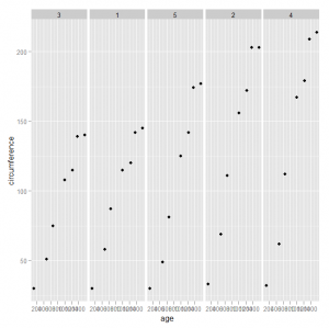
This will produce a graph like this:
The downside with this graph is that the individual panels are stretched vertically which may distort the interpretation of the graph. We can add the facet aspect to the graph object created by the qplot function using code such as:
qplot(age, circumference, data = Orange) + facet_wrap(~ Tree) |
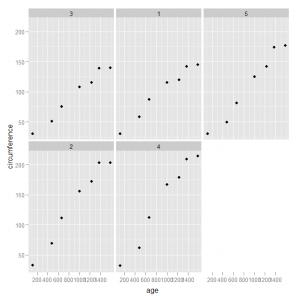
The facet_wrap function takes a single variable for conditioning and places the panels on multiple lines, which in this example will lead to a more appealing display:
This only scratches the surface of the power of faceting in the ggplot2 library. There are many options that can be controlled to change the appearance to suit a specific set of data.


