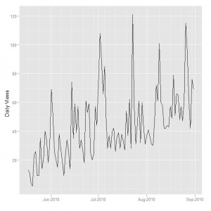
There are various ways to plot data that is represented by a time series in R. The ggplot2 package has scales that can handle dates reasonably easily.
Fast Tube by Casper
As an example consider a data set on the number of views of the you tube channel ramstatvid. A short snippet of the data is shown here:
> head(yt.views)
        Date Views
1 2010-05-17    13
2 2010-05-18    11
3 2010-05-19     4
4 2010-05-20     2
5 2010-05-21    23
6 2010-05-22 26 |
The ggplot function is used by specifying a data frame and the aes maps the Date to the x-axis and the number of Views to the y-axis.
ggplot(yt.views, aes(Date, Views)) + geom_line() +
scale_x_date(format = "%b-%Y") + xlab("") + ylab("Daily Views") |
The axis labels for the Date variable are created with the scale_x_date function where the format is specified as a Month/Year combination with the %b and %Y formatting strings. The graph that is produced is shown here:
Other useful resources are provided on the Supplementary Material page.


very helpful, thanks
i would like to transfer my ts plots to qplots … is there any way i can plot ts data with qplot from ggplot2?
Have a look here for a solution to your question: autoplot example. Hopefully this will do the trick!
Guys,
We need to r library “scales” to view the graph showing month-year(Jan-13) format.
Here is the syntax :
ggplot(yt.prices,aes(Date,Prices))+geom_line()+
scale_x_date(breaks = “1 month”,labels=date_format(“%b/%y”)) + xlab(” “) + ylab(“xx – Prices”)
Regards,
Jagan