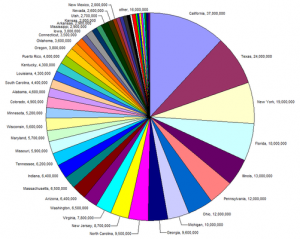
The pie chart is a frequently seen graph that uses area to compare percentages for a set of categories. Although this type of graph is based on comparing single metric for each category the display is two dimensional but sometimes even appears in three dimensions.
Strengths:
Other than familiarity with this type of display it is difficult to identify a situation where a pie chart would be a good way to display data. Pie Charts are also available in a wide range of software packages, although that isn’t really a good reason to recommend them!
Weaknesses:
The help files in R for the pie function provide the following advice:
Pie charts are a very bad way of displaying information. The eye is good at judging linear measures and bad at judging relative areas. A bar chart or dot chart is a preferable way of displaying this type of data.
The main question is why would we use two dimensions (relative area further confused by angle of the wedges) to make a one dimensional comparison?

