A level plot is a type of graph that is used to display a surface in two rather than three dimensions – the surface is viewed from above as if we were looking straight down and is an alternative to a contour plot – geographic data is an example of where this type of graph would be used. A contour plot uses lines to identify regions of different heights and the level plot uses coloured regions to produce a similar effect.
To illustrate this type of graph we will consider some surface elevation data that is available in the geoR package. The data set in this package is called elevation and stores the elevation height in feet (as multiples of ten feet) for a grid region of x and y coordinates (recorded as multiples of 50 feet). To access this data we load the geoR pacakage and then use the data function:
require(geoR) data(elevation) |
For some packages we need the call to the data function to make a set of data available for our use. The elevation object is not a data frame so our first step is to create our own data frame to be used to create the level plots using the different graphics packages.
elevation.df = data.frame(x = 50 * elevation$coords[,"x"], y = 50 * elevation$coords[,"y"], z = 10 * elevation$data) |
We extract the x and y grid coordinates and the height values, multiplying them by 50 and 10 respectively to convert to feet for the graphs. Rather than trying to plot the individual values we need to create a surface to cover the whole grid region as the points themselves are too sparse. We make use of the loess function to fit a local polynomial trend surface (using weighted least squares) to approximate the elevation across the whole region. The function call for a local quadratic surface is shown below:
elevation.loess = loess(z ~ x*y, data = elevation.df, degree = 2, span = 0.25) |
The next stage is to extract heights from this fitted surface at regular intervals across the whole grid region of interest – which runs from 10 to 300 feet in both the x and y directions. The expand.grid function creates an array of all combinations of the x and y values that we specify in a list. We choose a range every foot from 10 to 300 feet to create a fine grid:
elevation.fit = expand.grid(list(x = seq(10, 300, 1), y = seq(10, 300, 1))) |
The predict function is then used to estimate the surface height at all of these combinations of x and y coordinates covering our grid region. This is saved as an object z which will be used by the base graphics function:
z = predict(elevation.loess, newdata = elevation.fit) |
The lattice and ggplot2 expect the data in a different format so we make use of the as.numeric function to convert from a table of heights to a single column and append to the object we create based on all combinations of x and y coordinates:
elevation.fit$Height = as.numeric(z) |
The data is now in a format that can be used to create the level plots in the various packages.
Base Graphics
The function image in the base graphics package is the function we use to create a level plot. This function requires a list of x and y values that cover the grid of vertical values that will be used to create the surface. These heights are specified as a table of values, which in our case was saved as the object z during the calculations on the local trend surface.
The text on the axis labels are specified by the xlab and ylab function arguments and the main argument determines the overall title for the graph. The function call below creates the level plot:
image(seq(10, 300, 1), seq(10, 300, 1), z, xlab = "X Coordinate (feet)", ylab = "Y Coordinate (feet)", main = "Surface elevation data") box() |
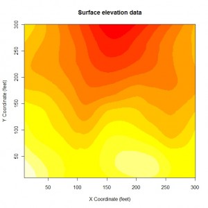
After the image function is used we call the box function mainly for aesthetic purposes to ensure there is a line surrounding the level plot. The graph that is created is shown below:
The default colour scheme used by the base graphics produces an attractive level plot graph where we can easily see the variation in height across the grid region. It is basically a fancy version of a contour plot where the regions between the contour lines are coloured with different shades indicating the height in those regions.
Lattice Graphics
The lattice graphics package provides a function levelplot for this type of graphical dispaly. We use the data stored in the object elevation.fit to create the graph with lattice graphics.
levelplot(Height ~ x*y, data = elevation.fit, xlab = "X Coordinate (feet)", ylab = "Y Coordinate (feet)", main = "Surface elevation data", col.regions = terrain.colors(100) ) |
The formula is used to specify which variable to use for the three axes and a data frame where the values are stored – as there are three dimensions it is the z axis that is specified on the left hand side of the formula. The axes labels and title are specified in the same way as the base graphics.
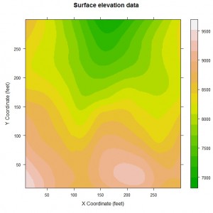
The range of colours used in the lattice level plot can be specified as a vector of colours to the col.regions argument of the function. We make use of the terrian.colors function to create this vector which a range of 100 colours which are less striking than those used above with the base graphics. The level plot that we can is shown here:
This is in general similar to the base graphics display but the actual plot region is a different shape that makes things look slightly different.
ggplot2
The ggplot2 package also provides facilities for creating a level plot making use of the tile geom to create the desired graph. The function ggplot forms the basis of the graph and various other options are used to customise the graph:
ggplot(elevation.fit, aes(x, y, fill = Height)) + geom_tile() +
  xlab("X Coordinate (feet)") + ylab("Y Coordinate (feet)") +
  opts(title = "Surface elevation data") +
  scale_fill_gradient(limits = c(7000, 10000),low = "black",high = "white") +
  scale_x_continuous(expand = c(0,0)) +
scale_y_continuous(expand = c(0,0)) |
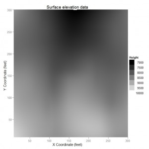
This large number of options that are added to the graph change various settings. The choice of colours for the heights used on graph is selected by the scale_fill_gradient function with colours ranging from black to white. The scale_x_continuous and scale_y_continuous options are used to stretch the tiles to cover the whole grid region covering up the default gray background – this makes the graph more visually appealing. The graph that is produced is shown here:
The graph from ggplot2 is visually as impressive as the other graphs – there is more smoothing between the colours which blurs some of the lines on the other graphs because of the type of colour gradient that was selected.
This blog post is summarised in a pdf leaflet on the Supplementary Material page.


How do you not get the white lines in your first two images? The only way I can prevent white lines in levelplot is to make it a raster image. There is no such option for “image” function that I can see. I am using 64-bit 2.13.1 (2011-07-08) on Win7 64bit.
I installed 2.12.2 and the image looks fine. Something was changed in 2.13 that broke the graphing utility.
Fair enough. Hopefully that will be fixed when the R 2.13 packages are updated over time.
I like that ggplot2 is fairly easy to use, but is it possible, in plots like these, to reverse the dang legend? I’m not sure what the developers were thinking putting the low numbers on top and high numbers on bottom. Honestly, who looks at numbers like that!? I’ve looked through the documentation, but it only focuses on stacked bar charts.
Okay. I figured it out. Change the scale fill gradient command to: scale_fill_gradient(limits=c(10000,7000),low=”white”,high=”black”).
Essentially, the tag ‘low’ is paired with the first number in limits, and ‘high’ is paired with the second number. It’s a bit too confusing, I think, for a program that is trumpeting its purpose as being easier to use than those “other” packages. Thanks for the great, simple to follow tutorial!
Nicely worked out and thanks for sharing here! I agree with your comment that ggplot2 is not as easy to use as advertised. There are many aspects of it that are very good for the user but there are a handful that can be a bit frustrating.
Hi Ralph, I’m trying to reproduce your example with the following data.frame
> df.s
x y z
1 548067.9 4862540 482.269
2 547863.7 4862836 482.149
3 547688.1 4863063 482.117
4 547593.4 4863198 482.051
5 547480.4 4863417 481.859
6 547421.6 4863527 481.806
7 547383.2 4863598 481.868
8 547340.0 4863650 481.729
9 547337.2 4863484 481.835
10 547507.8 4863572 481.946
going on with, had to adjust span = 1, span = 0.25 results in ‘span to small’ warning
> elevation.loess = loess(z ~ x * y, data = df.s,
degree = 2, span = 1)
and
> elevation.fit = expand.grid(list(x = seq(547000, 549000, 1), y = seq(4862000, 4864000, 1)))
leading to
> z = predict(elevation.loess, newdata = elevation.fit)
> elevation.fit$Height = as.numeric(z)
results in NA values for z. It seems to me that something with the predict? step goes wrong but I’m unable to identify the problem
Stefan,
How many data points do you have and are they well spread out between the x and y limits?
Ralph