The histogram is a standard type of graphic used to summarise univariate data where the range of values in the data set is divided into regions and a bar (usually vertical) is plotted in each of these regions with height proportional to the frequency of observations in that region. In some cases the proportion of data points in each region is shown instead of counts.
The shape of the histogram is determined by the width and number of regions that divided up the data. A histogram provides an indication the following features of a set of data: the general shape, symmetry or skewness of data and modality (uni-, bi- or multi-modal). There are some situations where a different type of graph would be preferable but histograms are useful for describing the general features of the distribution of a set of data.
To illustrate creating a histogram we consider data from the AFL sports league in Australia and the total number of points scored by the home team in each fixture. If we assume that the data is in a comma separated text file, called afl_2003_2007.csv, then we would import that data using the following command saving the results in a data frame:
afl.df = read.csv("afl_2003_2007.csv") |
Edit: The data is available as AFL Data Set. Change the file extension manually to csv or change the command to reflect the different file name.
Base Graphics
Fast Tube by Casper
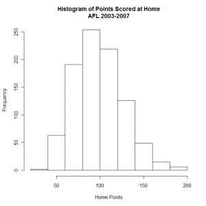
In base graphics the function hist is used to create a histogram with the first argument being the name of the vector that contains the data to be plotted. The x-axis is given a label using the xlab argument and the main argument is used to add a title to the graph. Code to create a histogram of home points is shown below:
hist(afl.df$Home.Total, xlab = "Home Points", main = "Histogram of Points Scored at Home\nAFL 2003-2007") |
The default option is to display bars representing the frequency of data values in each of the ranges and the overall look of the graph is basic as shown here:
The default algorithm for selecting number of bins to use for the histogram usually makes a sensible selection but this can be specified if required.
Lattice Graphics
Fast Tube by Casper
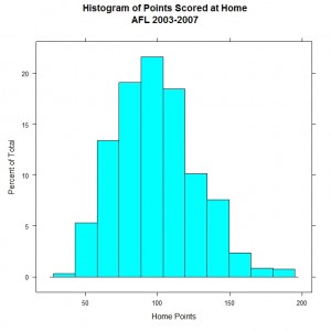
In the lattice graphics package there is a function histogram and we make use of the formula to specify a single variable for the number of points scored by the home team. The specification for the axis labels and graph title are the same as for the base graphics package. The equivalent graph is created using the following code:
histogram( ~ Home.Total, data = afl.df, xlab = "Home Points", main = "Histogram of Points Scored at Home\nAFL 2003-2007") |
Here the default option is the work with proportions of the total number of data points rather than counts so the shape of the distribution is slightly different when compared to the base graphics plot. The lattice version is shown below:
The main other difference is the choice of colour for the bars in the histogram and these can be adjusted by changing the global theme for lattice.
ggplot2
Fast Tube by Casper
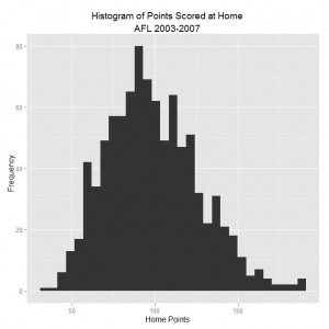
The ggplot2 library uses a general purpose graphics function called ggplot to create graphs of all types and the geom specifies the type of display to create, in this case a histogram. Components that make up the graph are added sequentially to build up the whole plot and in the example below we add axis labels and a main title.
ggplot(afl.df, aes(Home.Total)) + geom_histogram() +
  xlab("Home Points") + ylab("Frequency") +
opts(title = "Histogram of Points Scored at Home\nAFL 2003-2007") |
The default theme for ggplot2 is distinctive and the histogram is shown in the graph below:
The default number of bins is larger compared to base and lattice graphics which provides a rough distribution in this particular case. The online ggplot2 manual is a good source of information about customising graphs created using this approach.
This blog post is summarised in a pdf leaflet on the Supplementary Material page.


I did a similar series last year comparing base, lattice, ggplot2, and stata, for making histograms in a series of small multiples.
http://gettinggeneticsdone.blogspot.com/2009/09/comparison-of-plots-using-stata-r-base.html
Hello, I just found your website and wanted to let you know that it is an absolutely fantastic resource for learning R. One question though, do you happen to have the data files you use in the tutorials (such as the afl_2003_2007.csv file used in this post) stored any place that readers could download them and follow along?
I am glad that you have found the material that I have put on this blog useful. My intention is to keep plugging away adding more as I think of topics that would be useful for R users. As for the data sets I probably should go back and do some housekeeping on various posts to make sure that various files are available where appropriate.
If you have any suggestions then please feel free to add them to the feedback page. It will help me to focus on topics that are of interest to people rather than my assumptions of what I should write about! 🙂
Hi,
Where can I download the file afl.df_2003_2007? TIA
Post edited to link to the data set.