The analysis of variance (ANOVA) model can be extended from making a comparison between multiple groups to take into account additional factors in an experiment. The simplest extension is from one-way to two-way ANOVA where a second factor is included in the model as well as a potential interaction between the two factors.
As an example consider a company that regularly has to ship parcels between its various (five for this example) sub-offices and has the option of using three competing parcel delivery services, all of which charge roughly similar amounts for each delivery. To determine which service to use, the company decides to run an experiment shipping three packages from its head office to each of the five sub-offices. The delivery time for each package is recorded and the data loaded into R:
delivery.df = data.frame(
  Service = c(rep("Carrier 1", 15), rep("Carrier 2", 15),
    rep("Carrier 3", 15)),
  Destination = c(rep(c("Office 1", "Office 2", "Office 3",
    "Office 4", "Office 5"), 9)),
  Time = c(15.23, 14.32, 14.77, 15.12, 14.05,
  15.48, 14.13, 14.46, 15.62, 14.23, 15.19, 14.67, 14.48, 15.34, 14.22,
  16.66, 16.27, 16.35, 16.93, 15.05, 16.98, 16.43, 15.95, 16.73, 15.62,
  16.53, 16.26, 15.69, 16.97, 15.37, 17.12, 16.65, 15.73, 17.77, 15.52,
  16.15, 16.86, 15.18, 17.96, 15.26, 16.36, 16.44, 14.82, 17.62, 15.04)
) |
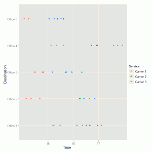
The data is then displayed using a dot plot for an initial visual investigation of any trends in delivery time between the three services and across the five sub-offices. The colour aesthetic is used to distinguish between the three services in the plot.
ggplot(delivery.df, aes(Time, Destination, colour = Service)) + geom_point() |
This code produces the following graph:
The graph shows a general pattern of service carrier 1 having shorter delivery times than the other two services. There is also an indication that the differences between the services varies for the five sub-offices and we might expect the interaction term to be significant in the two-way ANOVA model. To fit the two-way ANOVA model we use this code:
delivery.mod1 = aov(Time ~ Destination*Service, data = delivery.df) |
The * symbol instructs R to create a formula that includes main effects for both Destination and Service as well as the two-way interaction between these two factors. We save the fitted model to an object which we can summarise as follows to test for importance of the various model terms:
> summary(delivery.mod1)
                    Df  Sum Sq Mean Sq  F value    Pr(>F)
Destination          4 17.5415  4.3854  61.1553 5.408e-14 ***
Service              2 23.1706 11.5853 161.5599 < 2.2e-16 ***
Destination:Service  8  4.1888  0.5236   7.3018 2.360e-05 ***
Residuals           30  2.1513  0.0717
---
Signif. codes: 0 ‘***’ 0.001 ‘**’ 0.01 ‘*’ 0.05 ‘.’ 0.1 ‘ ’ 1 |
We have strong evidence here that there are differences between the three delivery services, between the five sub-office destinations and that there is an interaction between destination and service in line with what we saw in the original plot of the data. Now that we have fitted the model and identified the important factors we need to investigate the model diagnostics to ensure that the various assumptions are broadly valid.
We can plot the model residuals against fitted values to look for obvious trends that are not consistent with the model assumptions about independence and common variance. The first step is to create a data frame with the fitted values and residuals from the above model:
delivery.res = delivery.df delivery.res$M1.Fit = fitted(delivery.mod1) delivery.res$M1.Resid = resid(delivery.mod1) |
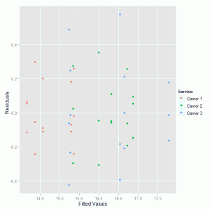
Then a scatter plot is used to display the fitted values and residuals where the colour asthetic highlights which points correspond to the three competing delivery services:
ggplot(delivery.res, aes(M1.Fit, M1.Resid, colour = Service)) + geom_point() +
xlab("Fitted Values") + ylab("Residuals") |
The xlab() and ylab() are used to change the text on the axis labels. The residual diagnostic plot is:
There are no obvious patterns in this plot that suggest problems with the two-way ANOVA model that we fitted to the data.
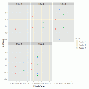
As an alternative display we could separate the residuals into destination sub-offices, where the facet_wrap() function instructs ggplot to create a separate display (panel) for each of the destinations.
ggplot(delivery.res, aes(M1.Fit, M1.Resid, colour = Service)) +
  geom_point() + xlab("Fitted Values") + ylab("Residuals") +
facet_wrap( ~ Destination) |
To produce the following alternative residual plot:
No obvious problems in this diagnostic plot.
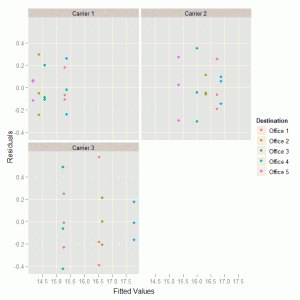
We could also consider dividing the data by delivery service to get a different view of the residuals:
ggplot(delivery.res, aes(M1.Fit, M1.Resid, colour = Destination)) +
  geom_point() + xlab("Fitted Values") + ylab("Residuals") +
facet_wrap( ~ Service) |
This creates the following graph:
Again there is nothing substantial here to lead us to consider an alternative analysis.
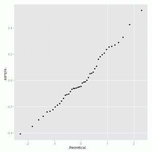
Lastly we consider the normal probability plot of the model residuals, using the stat_qq() option:
ggplot(delivery.res, aes(sample = M1.Resid)) + stat_qq() |
The quantile plot is:
This plot is very close to the straight line we would expect to observe if the data was a close approximation to a normal distribution. To round off the analysis we look at the Tukey HSD multiple comparisons to confirm that the differences are between delivery service 1 and the other two competing services:
> TukeyHSD(delivery.mod1, which = "Service")
  Tukey multiple comparisons of means
    95% family-wise confidence level

Fit: aov(formula = Time ~ Destination * Service, data = delivery.df)

$Service
                        diff        lwr       upr     p adj
Carrier 2-Carrier 1 1.498667  1.2576092 1.7397241 0.0000000
Carrier 3-Carrier 1 1.544667  1.3036092 1.7857241 0.0000000
Carrier 3-Carrier 2 0.046000 -0.1950575 0.2870575 0.8856246 |
Even with the multiple comparison post-hoc adjustment there is very strong evidence for the differences that we have consistenly observed throughout the analysis.
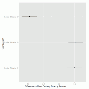
We can use ggplot to visualise the difference in mean delivery time for the services and the 95% confidence intervals on these differences. We create a data frame from the TukeyHSD output by extracting the component relating to the delivery service comparison and add the text labels by extracting the row names from the data frame.
delivery.hsd = data.frame(TukeyHSD(delivery.mod1, which = "Service")$Service) delivery.hsd$Comparison = row.names(delivery.hsd) |
We then use the geom_pointrange() to specify lower, middle and upper values based on the three pairwise comparisons of interest.
ggplot(delivery.hsd, aes(Comparison, y = diff, ymin = lwr, ymax = upr)) +
  geom_pointrange() + ylab("Difference in Mean Delivery Time by Service") +
coord_flip() |
The coord_flip() is used to make the confidence intervals horizontal rather than vertical on the graph. This can be confusing for creating the axis labels as we specify the label where it would appear prior to the filp of coordinates. In the example above we add text to the y axis but this now appears on the x axis in the final graph:

Thanks, lovely code, but would want this analysis to use Fishers LSD to compare Mean differences and also see an Interaction plot
Thanks, really useful
Daer this is great effort. i have some problems with ggplot. how could we install it and from where it is download. when i rum this line on R he answered and error in ggplot.
The ggplot2 library can be downloaded from the R project website – http://www.r-project.org/ or if you have an internet connection on the machine where the R software is installed then, if you are using Windows, you can use the packages menu to install it. If you are going to manually download and install the package be aware that you will also need to get hold of the supporting packages and install them as well.
Great walk-through of what I’ve been chasing; many thanks.
I’ve managed a mash-up to function fine with my data – however… how would you plot out just the different interactions between Destination and Service?