Analysis of Variance (ANOVA) is a commonly used statistical technique for investigating data by comparing the means of subsets of the data. The base case is the one-way ANOVA which is an extension of two-sample t test for independent groups covering situations where there are more than two groups being compared.
Fast Tube by Casper
Fast Tube by Casper
In one-way ANOVA the data is sub-divided into groups based on a single classification factor and the standard terminology used to describe the set of factor levels is treatment even though this might not always have meaning for the particular application. There is variation in the measurements taken on the individual components of the data set and ANOVA investigates whether this variation can be explained by the grouping introduced by the classification factor.
As an example we consider one of the data sets available with R relating to an experiment into plant growth. The purpose of the experiment was to compare the yields on the plants for a control group and two treatments of interest. The response variable was a measurement taken on the dried weight of the plants.
The first step in the investigation is to take a copy of the data frame so that we can make some adjustments as necessary while leaving the original data alone. We use the factor function to re-define the labels of the group variables that will appear in the output and graphs:
plant.df = PlantGrowth
plant.df$group = factor(plant.df$group,
labels = c("Control", "Treatment 1", "Treatment 2")) |
The labels argument is a list of names corresponding to the levels of the group factor variable.
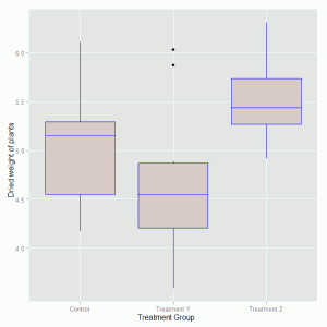
A boxplot of the distributions of the dried weights for the three competing groups is created using the ggplot package:
require(ggplot2)

ggplot(plant.df, aes(x = group, y = weight)) +
  geom_boxplot(fill = "grey80", colour = "blue") +
  scale_x_discrete() + xlab("Treatment Group") +
ylab("Dried weight of plants") |
The geom_boxplot() option is used to specify background and outline colours for the boxes. The axis labels are created with the xlab() and ylab() options. The plot that is produce looks like this:
Initial inspection of the data suggests that there are differences in the dried weight for the two treatments but it is not so clear cut to determine whether the treatments are different to the control group. To investigate these differences we fit the one-way ANOVA model using the lm function and look at the parameter estimates and standard errors for the treatment effects. The function call is:
plant.mod1 = lm(weight ~ group, data = plant.df) |
We save the model fitted to the data in an object so that we can undertake various actions to study the goodness of the fit to the data and other model assumptions. The standard summary of a lm object is used to produce the following output:
> summary(plant.mod1)

Call:
lm(formula = weight ~ group, data = plant.df)

Residuals:
    Min      1Q  Median      3Q     Max
-1.0710 -0.4180 -0.0060  0.2627  1.3690

Coefficients:
                 Estimate Std. Error t value Pr(>|t|)
(Intercept)        5.0320     0.1971  25.527   <2e-16 ***
groupTreatment 1  -0.3710     0.2788  -1.331   0.1944
groupTreatment 2   0.4940     0.2788   1.772   0.0877 .
---
Signif. codes:  0 ‘***’ 0.001 ‘**’ 0.01 ‘*’ 0.05 ‘.’ 0.1 ‘ ’ 1

Residual standard error: 0.6234 on 27 degrees of freedom
Multiple R-squared: 0.2641,     Adjusted R-squared: 0.2096
F-statistic: 4.846 on 2 and 27 DF, p-value: 0.01591 |
The model output indicates some evidence of a difference in the average growth for the 2nd treatment compared to the control group. An analysis of variance table for this model can be produced via the anova command:
> anova(plant.mod1)
Analysis of Variance Table

Response: weight
          Df  Sum Sq Mean Sq F value  Pr(>F)
group      2  3.7663  1.8832  4.8461 0.01591 *
Residuals 27 10.4921  0.3886
---
Signif. codes: 0 ‘***’ 0.001 ‘**’ 0.01 ‘*’ 0.05 ‘.’ 0.1 ‘ ’ 1 |
This table confirms that there are differences between the groups which were highlighted in the model summary. The function confint is used to calculate confidence intervals on the treatment parameters, by default 95% confidence intervals:
> confint(plant.mod1)
                       2.5 %    97.5 %
(Intercept)       4.62752600 5.4364740
groupTreatment 1 -0.94301261 0.2010126
groupTreatment 2 -0.07801261 1.0660126 |
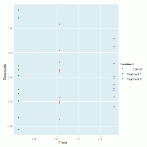
The model residuals can be plotted against the fitted values to investigate the model assumptions. First we create a data frame with the fitted values, residuals and treatment identifiers:
plant.mod = data.frame(Fitted = fitted(plant.mod1), Residuals = resid(plant.mod1), Treatment = plant.df$group) |
and then produce the plot:
ggplot(plant.mod, aes(Fitted, Residuals, colour = Treatment)) + geom_point() |
which produces this graph:

We can see that there is no major problem with the diagnostic plot but some evidence of different variabilities in the spread of the residuals for the three treatment groups.


Dear Ralph, thanks for real good content. will you please compile your writings into a pdf , thanks with regards, Dr.D.K.Samuel, Ind Inst of Hort Research, Bangalore India
Great post. Perhaps you could add how to plot confidence intervals on one’s plot.
I personally use aov() and draw the diagnostic plot of that model.
Dear Duleep,
My intention is to convert the blog posts into pdf documents for easier consumption online and offline. As you can see from supplementary material section of the website I have (slowly) started this process with producing graphs of various different types. If there are particular statistical methods that you feel should be covered then that is useful for me to know where to focus efforts in blogging.
Ralph
Romunov
The functions aov() and lm() can indeed be used to fit the same model and aov() has the advantage that when we summarise the fitted model object the output includes analysis of variance tables as the user might be expecting to see with the partitions based on the model terms.
Thanks for the suggesting about extending the blog post and I will look in to describing how to create graphs with means and confidence intervals and other usual ways to interrogate the model.
Ralph
In case you might be interested, I (w/ a coauthor) have created a package called ‘granova’ for R (now in ver. 2.0), that creates particularly helpful graphics for four classes of ANOVA. Further, we have now completed a paper (submitted for publication) on Elemenatal Graphics that provides extended documentation for the functions in the package. I will send it to you upon request.
The reason I’m writing is that I’m particularly impressed w/ your superb website at wekaleamstudios and find it helpful in many ways in my teaching statistics w/ R. (My special concerns have to do w/ graphics and visualization of data; also propensity score analysis for which I have a package: PSAgraphics.)
Best, Bob Pruzek (Professor, Statistics, NY)
Hi Bob,
Thanks for your positive comments on the blog and I think that I will investigate the R package you mention (granova) as I am particularly interested in the visual display of information. Having learnt a lot about R from reading freely available resources from other people I hope to give something back to other people who are finding their feet while learning R. An additional benefit for me of this blog is that I don’t have to carry round a large stack of books on R!
Many thanks
Ralph