It is not only possible to use tabular displays to summarise a data set and we will often be interested in using a graphical display as this might be a more effective way to visualise our data rather than using statistics such as the mean or standard deviation.
The histogram is a commonly used graphical display used to summarised univariate data and it provides a visual indication of the location and variation in the data. Histograms are constructed by dividing the data into ranges and count the number of data points that occur in each range and the height of the bar is based on this information.
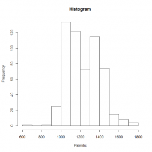
We can create a histogram using either the base graphics or lattice graphics in R. The function hist is part of the base graphics and the first argument we specify in the function call is the actual data to be used in the histogram. An example of creating a histogram would use the following code:
hist(olive.df$palmitic, xlab = "Palmitic", main = "Histogram") |
In this example we have also specified a label for the x-axis as well as the main title. The resulting graph looks like this:

Demonstration of using a histogram to summarise data
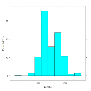
We can make use of the histogram function in the lattice library to create this plot and the syntax that we use is slightly different.
histogram( ~ palmitic, data = olive.df) |
The first argument is a model formula that specifies that data to be used for the histogram as the independent variable component of the formula and the data argument is used to specify a data frame in which the function will look for the data. The histogram looks slightly different using this library:

Demonstration of using a histogram to summarise data
There are other types of graph that can be used to summarise univariate data which include the bow and whisker plot, density plot, strip plot or dot plot. These will be covered in subsequent posts either using the base graphics system or lattice graphics.
