The system of Trellis displays was developed as a framework for visualising multivariable databases, and are used to investigate how a relationship between variables changes based on one or more conditioning variables (either discrete of continuous). The first implementation of Trellis was for the S-plus statistical software package, and there have been subsequent implementations in other statistical software packages including the R system via the lattice package. The development of the trellis paradigm was motivated by problems where complex relationships were under investigation.
Trellis displays are characterised by regular arrangement of panels that have the visual appearance of a trelliswork – hence the name of the framework. Each individual panel is used to display a subset of the data with a particular type of graphical display. The key to the approach is that it has been set up to ensure consistency between the different panels, e.g. common scales, sets of symbols to show grouping within each panel etc. There is scope for customising aspects of the visual display, e.g. colours, line types, fonts, but the framework has been developed to help avoid the common pitfalls associated with poor graphical displays.
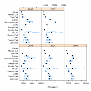
To illustrate the concept of conditioning variables consider the attendance at AFL matches during the seasons 2003 to 2007. A boxplot for the attendance at each venue with a separate panel for each season might look like:
The venue appear in the same order in each of the panels so we can visually check whether a particular year showed a different pattern. This graph would probably be improved by ordering the venues by maximum capacity or possibly average attendance over the five year period.
Other useful resources are provided on the Supplementary Material page.

