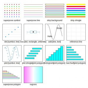
The Trellis graphics approach provides facilities for creating effective graphs with a consistent look and feel and one of the good things about the system is the use of themes to define the colour, size and other features of the components that make up a graph. The lattice package in R is an implementation of the approach and in this post we will consider how to change the default settings.
The main functions of interest are the pair trellis.par.get and trellis.par.set that are used to get hold of the settings for the current graphics device or to set a list of new parameters. The parameters themselves are described by a list object with information about a large range of possible options. To extract and save this information we would do the following:
my.theme = trellis.par.get() |
To get a feel for how many options can be specified we can look at the names of the components that make up this list:
> names(my.theme) [1] "grid.pars" "fontsize" "background" [4] "clip" "add.line" "add.text" [7] "plot.polygon" "box.dot" "box.rectangle" [10] "box.umbrella" "dot.line" "dot.symbol" [13] "plot.line" "plot.symbol" "reference.line" [16] "strip.background" "strip.shingle" "strip.border" [19] "superpose.line" "superpose.symbol" "superpose.polygon" [22] "regions" "shade.colors" "axis.line" [25] "axis.text" "axis.components" "layout.heights" [28] "layout.widths" "box.3d" "par.xlab.text" [31] "par.ylab.text" "par.zlab.text" "par.main.text" [34] "par.sub.text" |
There are a total of 34 components of this list that each have a set of other parameters that can be set by the user. For example, if we wanted to find out how lattice will draw a scatter plot then the plot.symbol component of the list is where we should be looking. We extract this information as follows:
> my.theme$plot.symbol $alpha [1] 1 $cex [1] 0.8 $col [1] "#0080ff" $font [1] 1 $pch [1] 1 $fill [1] "transparent" |
The plot symbol is 80% of the overall size specified for the system and the empty circle is the first shape symbol available – set by the pch component.
When there are groups in the data being plotted different shape symbols, colours etc. can be specified as part of the superpose.symbol component of the theme list. By default the settings are:
> my.theme$superpose.symbol $alpha [1] 1 1 1 1 1 1 1 $cex [1] 0.8 0.8 0.8 0.8 0.8 0.8 0.8 $col [1] "#0080ff" "#ff00ff" "darkgreen" "#ff0000" "orange" "#00ff00" "brown" $fill [1] "#CCFFFF" "#FFCCFF" "#CCFFCC" "#FFE5CC" "#CCE6FF" "#FFFFCC" "#FFCCCC" $font [1] 1 1 1 1 1 1 1 $pch [1] 1 1 1 1 1 1 1 |
There are seven possible groups that are specified in the default theme and the various options are in many cases the same name as for the base graphics system. If we wanted to make the symbols large then the cex option specifies a multiplier relative to the base size for symbols. The pch is used to indicate which plot symbol to use, and these are again the same as those provided when using base graphics.
So if we wanted to change the symbols to solid circles then we would adjust the my.theme list object to indicate a different plot symbol shape:
> my.theme$superpose.symbol$pch = rep(16, 7) > my.theme$superpose.symbol $alpha [1] 1 1 1 1 1 1 1 $cex [1] 0.8 0.8 0.8 0.8 0.8 0.8 0.8 $col [1] "#0080ff" "#ff00ff" "darkgreen" "#ff0000" "orange" "#00ff00" "brown" $fill [1] "#CCFFFF" "#FFCCFF" "#CCFFCC" "#FFE5CC" "#CCE6FF" "#FFFFCC" "#FFCCCC" $font [1] 1 1 1 1 1 1 1 $pch [1] 16 16 16 16 16 16 16 |
To update the graphics settings we would need to use the trellis.par.set function:
> trellis.par.set(my.theme) |
The new settings can be accessed via:
> show.settings() |
They are now as shown here:
The plot symbols are now solid rather than empty circles.

