A scatter plot is a graph used to investigate the relationship between two variables in a data set. The x and y axes are used for the values of the two variables and a symbol on the graph represents the combination for each pair of values in the data set. This type of graph is used in many common situations and can convey a lot of useful information.
To illustrate creating a scatter plot we will use a simple data set for the population of the UK between 1992 and 2009. This data is saved in a data frame uk.df using the following command:
uk.df = data.frame(Year = 1992:2009, Population = c(57770, 57933, 58096, 58258, 58418, 58577, 58743, 58925, 59131, 59363, 59618, 59894, 60186, 60489, 60804, 61129, 61461, 61796) ) |
For this example the data is recorded in thousands to make the graph easier to read and there is no benefit or noticeable improvement to be seen by using greater detail.
Base Graphics
Fast Tube by Casper
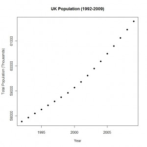
In the base graphics system the general purpose plot function can be used to create a scatter plot for the UK population data set that we created. The first two arguments to the plot function are the x and y variables respectively. The following code will create a scatter plot, including various labels:
plot(uk.df$Year, uk.df$Population, xlab = "Year", ylab = "Total Population (Thousands)", main = "UK Population (1992-2009)", pch = 16) |
The labels for the x and y axes are specified via the xlab and ylab arguments to the plot function and the main argument specifies the title for the plot.
The graph itself is plain and functional which solid circles indicating the population (in thousands) for each of the years covered by the data.
Lattice Graphics
Fast Tube by Casper
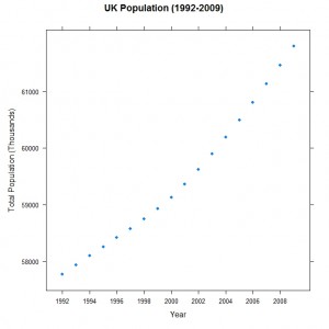
The lattice graphics package provides a function xyplot specifically to create scatter plots and the function is used in a similar way to the base graphics approach. The first argument to the function is a formula describing the relationship to be plotted on the graph, with the y variable preceding the x variable as we are used to when describing mathematical fomula such as y=a+bx. The data frame is specified with the data argument to simplify the expression in the formula. The code used is as follows:
xyplot(Population ~ Year, data = uk.df, xlab = "Year", ylab = "Total Population (Thousands)", main = "UK Population (1992-2009)", scales = list(x = list(at = seq(1992, 2009, 2))) ) |
The axis labels and the overall title for the graph are specified in the same way as the base graphics system. We indulge in some fine tuning of the labels on the x axis via the scales argument – here we indicate that every second year should be included on the label starting in 1992 and running until 2009. The lattice graph is shown here for comparison with the graphs created using the other two packages:
There are very few visual differences between the lattice and base graphics. In lattice graphics an object is created that can be edited to add or remove components and then printed to the screen. This approach is more flexible than the base graphics where the components are painted on top of each other and the use of themes in lattice will make it easier to keep a consistent look to all graphs in a document.
ggplot2
Fast Tube by Casper
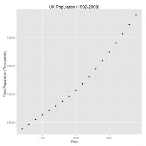
In the ggplot2 package the ggplot function is used to create graphs of all types rather than having a separate function defined for each type of graph. The first argument is adata frame with the data to be plotted and the aes argument specifies the aesthetics associated with the graph such as the point symbol, size or colour. In this case the Year variable appears on the x axis and the Population variable on the y axis. The code to create the scatter plot is shown here:
ggplot(uk.df, aes(Year, Population)) + geom_point() +
  xlab("Year") + ylab("Total Population (Thousands)") +
opts(title = "UK Population (1992-2009)") |
The geom_point specifies the type of graph to create (a scatter plot in this situation and this highlights the flexibility of the ggplot2 package as changing the geom will create a new type of graph) and the labels for the graph are created by adding them to the graph with the xlab, ylab and opts functions. The graph is shown below:
This graph is not greatly different to the scatter plot created using the base and lattice packages. The default theme in the ggplot2 package has a gray background with white grid lines that allows easy visual recognition of graphs created using this package.
This blog post is summarised in a pdf leaflet on the Supplementary Material page.


