A dot plot is a type of display that compares counts, frequencies, totals or other summary measures for a series of categories. The dot plot can be arranged with the categories either on the vertical or horizontal axis of the display to allow comparising between the different categories as well as comparison within categories where there are multiple symbols used to denote say different years.
In this post we will considered creating a dot plot using the base graphics, lattice graphics and ggplot2 approaches. To illustrate creating a dot plot we used data from the FAO website on the total irrigation area for Africa, Latin America, North America and Europe. We create a data frame using the following code:
irrigation.df = data.frame(
  Region = rep(c("Africa", "Latin America", "North America", "Europe"), 4),
  Year = factor(c(rep(1980, 4), rep(1990, 4), rep(2000, 4), rep(2007, 4))),
  Area = c(9.3, 12.7, 21.2, 18.8, 11.0, 15.5, 21.6, 25.3,
    13.2, 17.3, 23.3, 26.7, 13.6, 17.3, 23.8, 26.3)
) |
Base Graphics
Fast Tube by Casper
In the base graphics system we build up the dotplot with a series of commands. The first function call creates the graph region based on the data set but we do not plot any data by setting the type = “n” argument. The axis labels for the horizontal and vertical scales are set along with the title in the initial function call:
plot(irrigation.df$Area, irrigation.df$Region, xlab = "Area", ylab = "Region", main = "Irrigation Area by Region", type = "n") |
To add the points with separate colours for each of the four years we use the points function and subset to the particular year by testing a condition on the year. The col argument is used with a text string to specify the colour for the symbols for the given year:
points(irrigation.df$Area[irrigation.df$Year == 1980], irrigation.df$Region[irrigation.df$Year == 1980], col = "black", pch = 16) points(irrigation.df$Area[irrigation.df$Year == 1990], irrigation.df$Region[irrigation.df$Year == 1990], col = "blue", pch = 16) points(irrigation.df$Area[irrigation.df$Year == 2000], irrigation.df$Region[irrigation.df$Year == 2000], col = "red", pch = 16) points(irrigation.df$Area[irrigation.df$Year == 2007], irrigation.df$Region[irrigation.df$Year == 2007], col = "green", pch = 16) |
The code is rather long winded compared to the using the other two graphics packages. We can add a legend to the graph so that the years can be identified:
legend(10, 4, legend = c("1980", "1990", "2000", "2007"),
col = c("black", "blue", "red", "green"), pch = 16) |
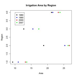
The placement of the legend uses the x and y coordinates within the graph to position the box. All the code above produces the following graph:
The graph is basic but we can consider the changes over time for the four regions. One downside is that the regions have been labelled with numbers rather than text strings.
Lattice Graphics
Fast Tube by Casper
The lattice graphics package has a function dotplot that is used to create dot plots. The first argument to the function is a formula describing the variables to use for the horizontal and vertical axes. We also specify the data frame to use for the graph and which column to determine different symbols and/or colours to highlight groupings within the plot:
dotplot(Region ~ Area, data = irrigation.df, groups = Year, main = "Irrigation Area by Region") |
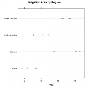
The lattice variant of the graph is shown here:
The graph is simple and very similar to the one produced using the base graphics with the advantage that the R code is not as complicated.
ggplot2
Fast Tube by Casper
The ggplot function is used to create the dot plot where we first specify the name of the data frame with the information to be displayed and then use the aes argument to list the variables to plot on the horizontal and vertical axes. The colour argument determines the variable to use for assigning colours to (usually) a categorical variable.
ggplot(irrigation.df, aes(x = Area, y = Region, colour = Year)) + geom_point() + opts(title = "Irrigation Area by Region") |
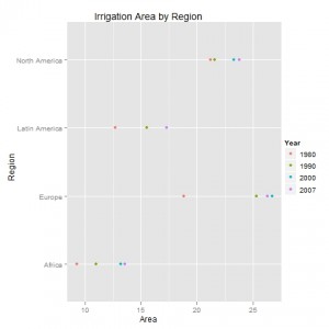
The ggplot2 version of the dot plot is shown below:
This graph is very similar to the ones produced using the other graphics packages but has the distinctive background and legend style that is used as the default option in ggplot2.
This blog post is summarised in a pdf leaflet on the Supplementary Material page.


[…] Summarising data using dot plots « Software for Exploratory Data Analysis and Statistical Mode… […]