A box and whisker plot is a type of graphical display that can be used to summarise a set of data based on the five number summary of this data. The summary statistics used to create a box and whisker plot are the median of the data, the lower and upper quartiles (25% and 75%) and the minimum and maximum values.
The box and whisker plot is an effective way to investigate the distribution of a set of data. For example, skewness can be identified from the box and whisker as the display does not make any assumptions about the underlying distribution of the data. The extreme values at either end of the scale are sometimes included on the display to show how far they extend beyond the majority of the data.
To illustrate creating box and whisker plots we consider UK meteorological data that has been collected on a monthly basis at Southampton, UK between 1950 and 1999 and is publicly available. This data is available from the UK Met Office and we will compare the range of temperatures recorded in each month of the year over this period by creating box and whisker plots with the different packages.
The data is assumed to have been imported into R and stored in a data frame called soton.df. An extract of the data is shown here:
Year Month Max.Temp Min.Temp Frost Rain 1 1950 Jan 7.7 2.8 7 20.1 2 1950 Feb 10.3 4 4 127.0 3 1950 Mar 13.0 4.5 2 39.4 4 1950 Apr 13.6 4.7 0 62.0 5 1950 May 17.9 7.8 0 32.2 |
Base Graphics
Fast Tube by Casper
The base graphics approach makes use of the boxplot function to create box and whisker plots. In this situation the function can be used with a formula rather than specifying two separate vectors of data – we can specify a data frame to point towards a source of data to be used in the graph. For the temperature data we use this code:
boxplot(Max.Temp ~ Month, data = soton.df, xlab = "Month", ylab = "Maximum Temperature", main = "Temperature at Southampton Weather Station (1950-1999)" ) |
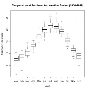
The horizontal and vertical axes labels are specified using the xlab and ylab arguments respectively and the title of the plot is created using the main argument. The box and whisker plot is shown here:
The function boxplot makes it easy to create a reasonably attractive box and whisker plot. The variation in the distribution of temperatures across the year can be seen from the graph.
Lattice Graphics
Fast Tube by Casper
In the lattice graphics package there is a function bwplot which is used to create box and whisker plots. The function call also uses a formula to specify the x and y variables to use on the graph. The function call arguments are identical to the boxplot function in base graphics:
bwplot(Max.Temp ~ Month, data = soton.df, xlab = "Month", ylab = "Maximum Temperature", main = "Temperature at Southampton Weather Station (1950-1999)" ) |
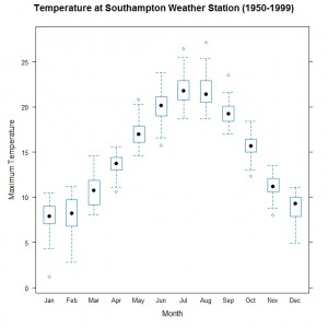
The variable Month is categorical so a separate box and whisker summary is created for each month separately. The lattice version of the graph is shown here:
This is very similar to the box and whisker plot created by base graphics with a similar level of effort required. The main difference is the use of a circle rather than a line to identify the location of the median of the data.
ggplot2
Fast Tube by Casper
In the ggplot2 package there is a general function ggplot that is used to create graphs of any type. We make use of the boxplot geom to create a box and whisker plot following the standard approach. The first step is to specify a data frame to use to create the graph and then map the columns of this data frame, via the \texttt{aes} argument, to the different axes or other aesthetics (such as colour or symbol shape). The particular geom is used to specify the type of plot that we want to create. Our final step is to add on the various axes labels and an overall title to the graph.
ggplot(soton.df, aes(Month, Max.Temp)) + geom_boxplot() +
  ylab("Maximum Temperature") +
opts(title = "Temperature at Southampton Weather Station (1950-1999)") |
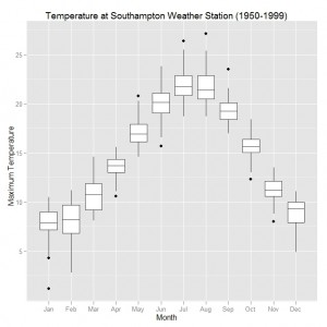
The ggplot2 version of box and whisker plots is shown here:
The distinctive gray background used by ggplot2 is an obvious visual difference compared to the default clear background used in the other two approaches. The boxes themselves have a cleaner look in this graph than the other two methods and the overall look is slick.
This blog post is summarised in a pdf leaflet on the Supplementary Material page.


hi!
thank you for the very interesting blog and the hints. Could you please provide also soton.df or at least the script you are using to get the data?
And btw: which latex package do you use to produce the pdf leaflets? They are very nice!
thanks in advance
I will look in to uploading the data as a csv file and link it on this page – the Met Office website has data for the other weather stations if you are interested in how the temperature varies in other parts of the UK.
Would it be useful for me to write a post (or two) about how I am using latex to create the pdf leaflets? It is a reasonable straightforward task (if you have some experience of latex).
Thanks for your comments.
Ralph
thanks for your reply.
Don’t worry about the data. I can get them from the Met office website. I just thought you have some script for doing this automatically.
As for latex: yes, I have expierence wiht latex. I was just wondering whether you are using some special package to get the 3 columns…
I guess, you manipulate then the pdf output to rotate the 2nd page, aren’t you?
(and please keep writing in your blog if you have time! it’s very interesting!
I use the leaflet class which should be available from the TeX archive – http://www.tex.ac.uk/. This is pretty straightforward to use and the coloured boxes are created using tikz. Apart from that there isn’t much to say about how I create the leaflets – the rotation is handled by the clever person who created the class not by any skill on my behalf. 🙂
There is plenty more that I intend to write about on this blog so hopefully I won’t run out of steam any time soon!
thanks!
Can you do multiple boxplots for different variables on one plot?
For example I have 4 different classes that all have monthly variables and I’d like to plot them next to each other. Just like your monthly plot but with four box’s for each month? Also each class has different lengths so I have it organized in a csv file where columns (Class,Jan,Feb,Mar,Apr,May,Jun,Jul,Aug,Sep,Nov,Dec).
I can get a plot easily by doing Class~Jan, but I need the month values on the x axis and sorted by class, and then the y-axis is the values on the months so [mm] for precipitation for example?
Thanks!
You can put boxplots side by side but you might consider whether you want to do that or not. The easiest way to create the plot is using the ggplot2 package. Here is an example of where I have used one of the data sets within R which you will hopefully be able to adapt:
nt = expand.grid(
Month = c(“Jan”,”Feb”,”Mar”,”Apr”,”May”,”Jun”,”Jul”,”Aug”,”Sep”,”Oct”,”Nov”,”Dec”),
Year = 1920:1939
)
nt$Temp = as.numeric(nottem)
nt$Decade = factor(ifelse(nt$Year <= 1929, "1920s", "1930s")) require(ggplot2) ggplot(nt, aes(Month, Temp, colour = Decade)) + geom_boxplot()
What would I have to use if I wanted individual data points (circles) to be shown inside each box and have the points by jittered? thx
I think you could add:
+ geom_point(aes(Month, Max.Temp), data = soton.df)
to the end of the ggplot command and that will put the points on top of the box plot. You might consider geom_jitter() instead if you have a lot of data and possibly over plotting.
thx it works great, I do have a lot of data. i am new to R and was hoping that you could guide me through a few more questions. how would I group differently for the x axis. Using your example of temp. I have created another column with the header for quarters and indicate Q1 for jan, feb, march…Q2 for apr, may, jun etc…how can place Q1, Q2, on teh x-axis and include the months right above it as jan, feb and march?
Hi I want to make a graph study site (x axis) and Number of seeds(y axis). Altogether i have 6 study sites , 3 study sites from 2 countries. I did the grpha like above. But i want to show 2 countries in 2 colours. How can i do that? Now the study sites are according to alphabatical order. so i want to take 3 study sites of one country together and the other 3 together as well.
Your help greatly appreciated.
Shyam,
If you want to map colour to a variable (e.g. country) then you would need to set it within the aes statement at the start of the line. Possibly like:
ggplot(yourdata, aes(x = Study.Site, y = Number.of.Seeds, colour = Country)) + geom_boxplot()
Ralph
Hi , I tried but received following message;
Error in `[.data.frame`(x, order(x, na.last = na.last, decreasing = decreasing)) :
undefined columns selected
what that mean? Anyway i did that using following command
season temp plot(Study.Site, y=Number of seeds, col=season[temp]) and it worked.
I did another graph using BWplot command for F.F ratio. Here again i have F.F ratio for 3 study sites from 2 countries . I used following script;
ffratio attach(ffratio)
> names(ffratio)
[1] “country” “site” “F.F.ratio”
> bwplot(F.F.ratio~site|country)
I received a graph separating two countries as i needed. but in both graphs all study sites (6 sites ) are shown in x axis. But only relevant 3 whisker plots are drawn. So it doesn’t look nice. I want to show only 3 sites relevant to that country in the x axis. How can i do that? any suggestion will be greatly appreciated since i urgently needed that to my thesis.
I am sorry. It was my mistake with the package. the script you sent to put colours worked nicely and i managed to do that . Thanks a lot.
Still i need help for my query in the earlier message to remove unwanted site names in the x axis.
thanks a lot.
Hi all,
i used the following script for my data;
bwplot(flower.number~site|country)
So i get two plots for two countries i have. Each plot study sites of both countries are labled. Can somebody tell me how to remove unwanted lables from x axis.
Great help