The ggplot2 package can be used as an alternative to lattice for producing high quality graphics in R. The package provides a framework and hopefully simple interface to producing graphs and is inspired by the grammar of graphics.
The main function for producing graphs in this package is qplot, which stands for quick plot. The first two arguments to the function are the name of objects that contain the x and y variables for the plot that is being created. Like many functions in R there is a data argument that can be used to specify a data frame to look in for the variables.
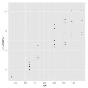
As a first example we create a scatterplot of age and circumference for the data set in R that has measurements of the growth of Orange trees. The code to produce this graph is very simple and is shown below:
qplot(age, circumference, data = Orange) |
This produces the following graph:
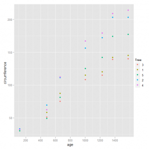
The main thing with this graph is that we are ignoring the different trees and looking at the overall trend. If we want to distinguish between the growth for the trees separately we can use different colours for the plotting symbols and add a legend to indicate which colour corresponds to a given tree. The colour argument is used to specify a variable and qplot will automatically created a legend based on the levels of this categorical variable. We adjust our code to be:
qplot(age, circumference, data = Orange, colour = Tree) |
and the graph now looks like:
That is a nice improvement on the initial graph as we can visually compare the growth trends for the five trees.
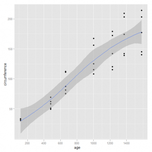
We can build additional elements into our graph, such as adding a smoother to show a trend, by making use of the geom argument which is used to specify what type of display is being created. The package has a nice feat that allows us to specify a vector with multiple elements to build up additional elements to the graph. We can add a smoother to the original plot with the code below:
qplot(age, circumference, data = Orange, geom = c("point", "smooth")) |
This produces the following graph:
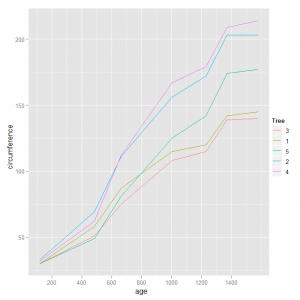
An alternative would be to change from plotting with symbols to joining the points with lines. This change again makes use of the geom argument as follows:
qplot(age, circumference, data = Orange, colour = Tree, geom = "line") |
The graph now looks like:
with a separate coloured line for each tree.


